
Color does more heavy lifting in a room than almost any other design element. It sets mood, changes perceived dimensions, and either ties a space together or leaves it feeling disjointed. But walk into any paint store and you’ll face thousands of chips, each with names that sound like they were dreamed up by a poet on deadline.
This guide cuts through the confusion. It covers the fundamentals of color theory, walks through practical selection strategies room by room, and flags the mistakes that trip up even experienced DIYers. Whether you’re repainting a single accent wall or planning a whole-home refresh, these principles will help you choose palettes that actually work.
Table of Contents
ToggleKey Takeaways
- Interior design color sets mood, changes perceived room dimensions, and creates cohesion—making it one of the most impactful design elements in any space.
- The 60-30-10 rule provides a reliable formula for balanced color schemes: 60% dominant color (walls), 30% secondary (upholstery and rugs), and 10% accent (accessories and art).
- Always test paint samples directly on your walls for at least 24 hours in all lighting conditions, as undertones and lighting dramatically affect how colors appear in your home.
- Match your color palette to the room’s natural light direction: warm tones for cool north-facing rooms, and cooler hues for south-facing spaces receiving strong, warm light throughout the day.
- Avoid common color mistakes like ignoring undertones, overusing accent colors, painting before selecting furnishings, and applying trendy colors to permanent surfaces—save bold colors for easily changeable elements instead.
Understanding the Basics of Color Theory in Interior Design
Color theory isn’t just for art students. It’s a practical framework that explains why certain combinations feel cohesive and others clash.
The color wheel organizes hues into primary (red, blue, yellow), secondary (green, orange, purple), and tertiary blends. Complementary colors sit opposite each other, think navy and burnt orange, and create high contrast. Analogous schemes use neighbors on the wheel (blue, blue-green, green) for a harmonious, low-contrast look. Triadic palettes pull three evenly spaced hues for balanced energy.
Beyond hue, pay attention to value (lightness or darkness) and saturation (intensity). A room painted in high-saturation jewel tones feels energetic but can overwhelm if every surface competes. Desaturated or muted tones, grays, taupes, dusty pastels, offer flexibility and let furnishings stand out.
The 60-30-10 rule is a reliable formula: 60% dominant color (walls, large furniture), 30% secondary (upholstery, rugs, curtains), and 10% accent (pillows, art, accessories). This ratio prevents any single hue from taking over while maintaining visual interest. Designers frequently rely on this balanced approach to keep schemes grounded.
Finally, understand undertones. A “white” paint can lean pink, yellow, blue, or green depending on its undertone. Test samples on your actual walls in different lighting before committing to gallons. What looks crisp in the store may read jaundiced under your LED bulbs at home.
How to Choose the Right Color Scheme for Your Space
Start by assessing the room’s natural light. North-facing rooms receive cooler, indirect light and benefit from warm tones (creams, soft yellows, terracotta) to counteract the chill. South-facing spaces get strong, warm light throughout the day, so cooler grays, blues, or greens prevent the room from feeling overheated. East- and west-facing rooms shift dramatically from morning to evening: test samples at multiple times of day.
Consider the room’s function and mood. High-traffic areas like kitchens and mudrooms handle durable, washable finishes in forgiving mid-tones. Relaxation spaces (bedrooms, reading nooks) typically benefit from low-contrast, muted palettes. Active zones (home gyms, playrooms) can take brighter, more energizing hues.
Look at your existing fixtures and finishes. If you’re not replacing flooring, countertops, or tile, your palette needs to work with what’s already there. Warm oak floors clash with cool grays: instead, try greiges or warm whites. Bold granite or tile can anchor your scheme, pull accent colors directly from the stone’s veining.
Many DIYers find inspiration on platforms like Homedit, which showcase real-world applications of different palettes. Just remember: a color that works in a minimalist loft with 12-foot ceilings may not translate to a suburban ranch with 8-foot ceilings and builder-grade trim.
Once you’ve narrowed options, buy sample pots (usually quarts) and paint 2’×2′ squares directly on the wall, not poster board. Observe them for at least 24 hours in all lighting conditions. Colors shift as daylight changes and artificial lighting kicks in.
Popular Interior Design Color Trends for 2026
Trends come and go, but 2026 leans into a few distinct directions that reflect broader cultural shifts toward comfort, sustainability, and authenticity.
Earthy neutrals continue their dominance. Think warm taupes, clay, terracotta, and soft ochre, colors that ground a space without the starkness of pure white or the coolness of gray. These work especially well in modern classic interiors that blend traditional architecture with contemporary furnishings.
Muted greens, sage, olive, mossy tones, are everywhere, from cabinetry to accent walls. They bring nature indoors without the intensity of emerald or forest green, and they pair beautifully with natural wood and brass hardware.
Warm whites and off-whites are replacing the cool, stark whites that dominated the 2010s. Look for whites with cream, peach, or slight yellow undertones. These feel softer and more inviting, especially in homes with abundant natural light.
Dusty blues and soft charcoals offer a sophisticated alternative to navy and black. They add depth without feeling heavy, and they layer well with both warm and cool accent colors.
There’s also renewed interest in bolder historical palettes. Deep plums, brick reds, and burnt oranges nod to 2000s interior design but applied with more restraint, one accent wall or a single piece of statement furniture rather than an entire room.
Trends are useful inspiration, but they shouldn’t override what works for your home’s architecture, light, and your personal taste. A color that’s “in” but makes you uncomfortable every time you walk into the room is a poor investment.
Room-by-Room Color Selection Strategies
Living Rooms and Common Areas
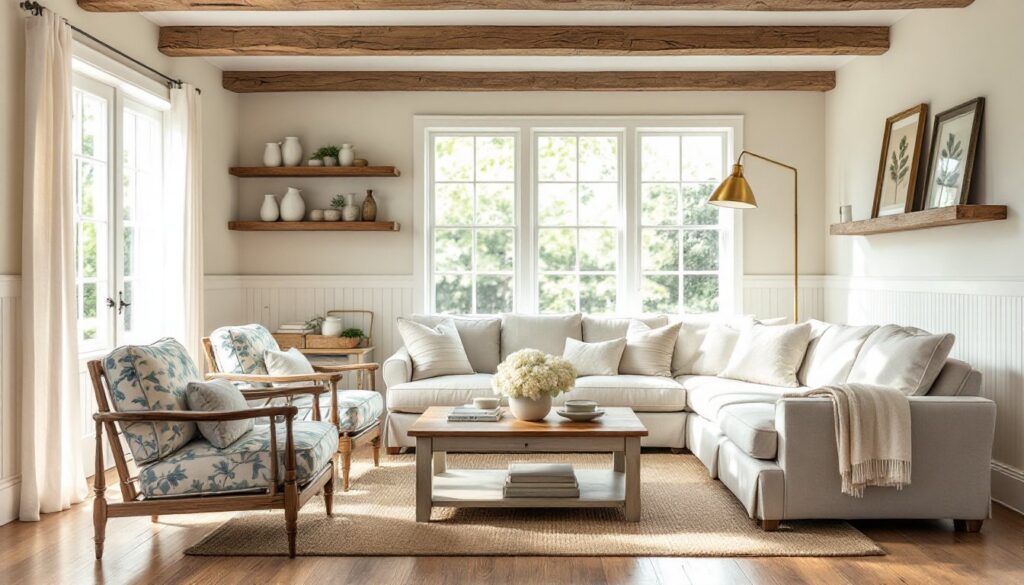
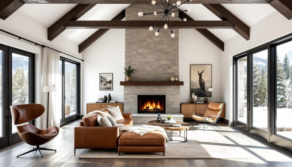
Living rooms handle the most diverse activities, entertaining, relaxing, playing, so versatility matters. Mid-tone neutrals (greiges, taupes, soft grays) provide a flexible backdrop that works year-round and with changing decor.
If you want color, consider an accent wall behind the sofa or fireplace. This adds visual interest without overwhelming the space. Choose a hue 2-3 shades deeper than your main wall color, or go bold with a jewel tone if your furnishings are neutral.
Ceiling color is often overlooked. Pure white ceilings can feel stark against warm walls: instead, use your wall color at 25% strength (ask your paint store to mix this) for a cohesive look. In rooms with low ceilings, a lighter ceiling than walls helps maintain a sense of height.
For open-concept spaces, maintain visual flow by using the same base color in adjacent areas and varying it with accents. This prevents the jarring effect of walking from a blue kitchen into a green living room with no transition.
Spaces inspired by Scandinavian design often use whites and light grays as a foundation, then layer texture and warmth through textiles and natural wood rather than relying on wall color alone.
Bedrooms and Private Spaces
Bedrooms benefit from low-contrast, calming palettes. Soft blues, greens, lavenders, and warm neutrals promote relaxation. Save high-energy colors (bright yellows, oranges, reds) for accent pillows or artwork, not large surfaces.
Matte or eggshell finishes are ideal for bedrooms. They absorb light rather than reflecting it, creating a softer, cozier feel than satin or semi-gloss. Reserve glossier finishes for trim and doors.
Kids’ rooms present a challenge: children’s tastes change quickly. Instead of painting all four walls bubblegum pink or race-car red, choose a neutral base and add color through removable elements, bedding, curtains, wall decals. This makes updates easier and less costly as they grow.
In primary bedrooms, consider different tones for different walls. A slightly deeper shade behind the bed creates a subtle focal point without the drama of a full accent wall. This technique works especially well in modern beach house interiors, where layered neutrals mimic sand, driftwood, and sea foam.
Bathrooms attached to bedrooms should coordinate but not match the bedroom palette. Pull one accent color from the bedroom and use it as the bathroom’s secondary hue to create visual continuity without monotony.
Common Color Mistakes to Avoid in Your Home
Skipping the sample stage is the most common error. Paint looks different on a chip, on a screen, and on your wall. Always test samples in the actual room, observing them in morning, afternoon, and evening light.
Ignoring undertones leads to unintentional clashes. A “gray” with blue undertones next to beige trim creates a cold, disjointed look. Match undertones across your palette, all warm or all cool, unless you’re intentionally creating contrast.
Painting before choosing furnishings puts the cart before the horse. It’s easier to match paint (available in thousands of colors) to a sofa or rug (available in dozens) than the reverse. Gather fabric swatches, flooring samples, and furniture finishes first.
Overusing white in the wrong spaces backfires. Pure white in a north-facing room with little natural light looks dingy and gray. It also shows every scuff and fingerprint. If you want a light, airy feel, choose an off-white with warm undertones instead.
Too many accent colors creates visual chaos. Stick to 3-4 colors max across a room: a dominant neutral, a secondary hue, and one or two accents. More than that, and the eye doesn’t know where to land.
Forgetting about sheen is another misstep. Flat paint hides imperfections but doesn’t clean well, fine for low-traffic adult bedrooms, poor for hallways and kids’ rooms. Eggshell or satin finishes balance durability and appearance for most spaces. Semi-gloss works for trim, doors, and high-moisture areas like bathrooms.
Matching everything looks flat and dated. Rooms inspired by Greek interior design often layer multiple shades of white and blue rather than using a single hue, creating depth and interest.
Finally, trendy colors on permanent surfaces can date your home. Bold colors on easily changed elements (pillows, art, small furniture) let you ride trends without committing to a years-long relationship with millennial pink walls. Save neutrals for big-ticket, hard-to-change items like cabinetry and tile.
For more guidance on foundational design principles that work across color palettes, explore resources on core design concepts that emphasize balance, proportion, and timeless appeal. Color is powerful, but it’s just one layer of a well-designed space.