
Walk into a cluttered room and the walls seem to close in. Step into a well-planned space and breathing feels easier, even if the square footage is identical. That’s the power of space in interior design. It’s not about having more rooms or bigger floor plans. It’s about using what you’ve got strategically, balancing filled and empty areas, and creating paths that make sense for how people actually move through a home. Understanding space planning interior design turns cramped quarters into functional layouts and oversized rooms into cohesive zones. Whether you’re rearranging a living room or gutting a kitchen, getting space right is the foundation everything else sits on.
Table of Contents
ToggleKey Takeaways
- Space in interior design balances positive space (furniture and objects) with negative space (empty areas), with a 60/40 split serving as an ideal starting point for functional rooms.
- Understanding space planning and circulation ensures rooms function well—main walkways need a minimum of 36 inches, and specific clearances prevent furniture from blocking doorways or daily movement.
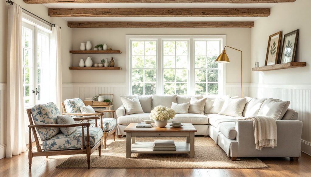
- Floating larger furniture pieces like sofas away from walls creates defined zones and improves flow, while area rugs help signal functional areas without cluttering open floor space.
- Rooms feel cramped or cold based on spatial balance, not just square footage; poor space planning can’t be fixed with decor alone, making it foundational to design success.
- Common space-wasting mistakes—oversized furniture, pushing everything against walls, and blocking windows—are easily fixable through measurement, vertical storage, and intentional zone planning.
What Does Space Mean in Interior Design?
In design terms, space refers to the physical area within a room, both the footprint and the volume up to the ceiling. It’s the canvas every other element (furniture, lighting, color) gets placed onto. But space isn’t just empty square footage. It’s three-dimensional, and how designers handle it determines whether a room feels open and functional or cramped and awkward.
Space breaks down into two categories: the areas occupied by objects (positive space) and the areas left empty (negative space). A sofa, coffee table, or bookshelf fills positive space. The walking path between them, the breathing room around a bed, and the clear wall above a console table are all negative space. Interior design and space planning rely on balancing these two types to create rooms that work visually and practically.
Good space planning also accounts for circulation, the invisible paths people follow through a room. A dining room might have enough square footage for a table that seats eight, but if chairs can’t be pulled out without blocking the doorway, the space fails functionally. Designers measure clearances in inches: 36 inches minimum for main walkways, 24 inches behind dining chairs when seated, 30-42 inches between a kitchen island and counters. These aren’t arbitrary numbers, they come from ergonomic standards and building codes like the International Residential Code (IRC), which sets baseline clearances for accessibility and safety.
The Two Types of Space: Positive and Negative
Positive space is the stuff, furniture, decor, appliances, built-ins. It’s what you buy, build, or arrange. Negative space is everything else: the open floor, the empty wall, the gap between the sofa and the TV stand. Both matter equally, but negative space often gets ignored or filled reflexively because blank areas feel “incomplete.”
Too much positive space, and a room becomes a maze. Picture a living room crammed with an oversized sectional, two armchairs, a coffee table, side tables, a media console, and a bookcase, all fighting for attention. There’s no visual rest, nowhere for the eye to land. Movement becomes a sideways shuffle. Rooms like these often happen when homeowners try to maximize seating or storage without considering circulation or proportion.
Too much negative space has the opposite problem: a room feels empty, unfinished, or cold. A king bed floating alone in a 400-square-foot primary bedroom with nothing on the walls and no nightstands leaves negative space unbalanced. Designers working with modern design approaches often embrace negative space deliberately, but even minimalist rooms need intentional anchoring, a rug to define the bed zone, a bench at the foot, or a piece of art scaled to the wall.
The sweet spot is a 60/40 split, roughly 60% positive space (furniture and objects) to 40% negative space (open floor and walls). This isn’t a hard rule, but it’s a starting point. In a 12×15-foot living room (180 square feet), aim for around 72 square feet of open floor after furniture placement. That leaves room to walk, vacuum, and rearrange without feeling hemmed in. Tools like painter’s tape can help visualize furniture footprints before moving heavy pieces.
Why Space Matters More Than You Think
Space planning isn’t cosmetic, it’s structural to how a home functions. Get it wrong, and no amount of throw pillows or paint color will fix the underlying problem. Rooms that feel “off” usually have spatial issues: blocked sightlines, awkward traffic patterns, or furniture that doesn’t fit the scale of the space.
Poor space planning creates real friction. A narrow hallway with a console table jutting out becomes a daily obstacle course. A kitchen island placed less than 42 inches from the counter traps the cook when cabinet doors swing open. A bedroom where the door hits the bed frame means mornings start with frustration. According to research highlighted on Apartment Therapy, even minor layout adjustments, like rotating a sofa 90 degrees or swapping a bulky dresser for wall-mounted storage, can significantly improve daily usability.
Good space planning does the opposite. It reduces clutter, improves flow, and makes rooms feel larger without adding square footage. When working on projects that involve remodeling and spatial reconfiguration, professionals prioritize circulation first, then zone activities (cooking, dining, lounging), and finally select furniture scaled to fit. This order prevents the common mistake of buying a sofa first and discovering it overwhelms the room.
Space also affects perception. A room with balanced negative space reads as calm and organized. Crowded rooms trigger stress responses, our brains process visual clutter the same way they process mental clutter. That’s why minimalist or Scandinavian layouts feel restful: they leave breathing room around each object, so nothing competes for attention.
Practical Ways to Use Space Effectively in Your Home
Theory only goes so far, here’s how to apply space planning principles room by room.
Create Flow with Furniture Placement
Start by mapping primary traffic paths, the routes people take from doorways to seating areas, from the kitchen to the dining table, from the bedroom door to the closet. These paths should be straight and unobstructed, ideally 36-48 inches wide.
In living rooms, arrange seating to encourage conversation without blocking the main walkway. Float a sofa away from the wall if the room is large enough (at least 12×14 feet), this creates a zone and leaves circulation space behind it. Use area rugs to define functional zones. A rug under the sofa and coffee table signals “sitting area,” while the open floor around it becomes circulation space. Rugs should extend at least 6 inches beyond furniture on all sides, or all furniture legs should sit on the rug, half-on, half-off looks accidental.
For dining rooms, measure clearances before buying a table. Add the table length/width plus 48 inches on all sides for chairs and circulation. A table that fits the room’s footprint but leaves no space to walk behind diners creates a bottleneck. If the room is tight, consider a round table, it eliminates corners and often improves flow in square rooms.
Kitchens rely on the work triangle: sink, stove, and refrigerator should form a triangle with sides between 4 and 9 feet each. Islands are popular, but they only work if the kitchen has at least 8 feet of width to maintain the 42-inch clearance on both sides. In smaller kitchens, a peninsula or movable cart often works better. Design resources like MyDomaine offer detailed kitchen layout examples for various footprints.
Balance Positive and Negative Space
Visually scan each room for imbalance. If one wall is packed with furniture and the opposite wall is bare, redistribute. If the floor is cluttered but walls are empty, consider vertical storage, floating shelves, wall-mounted cabinets, or pegboards, to free up floor space.
Use the rule of thirds from photography: divide walls into three horizontal or vertical sections and place focal points (art, mirrors, shelving) along those lines rather than dead center. This creates visual interest without adding clutter.
Leave at least 30% of wall space blank. Negative space on walls is just as important as on floors, it gives the eye a place to rest. In bedrooms, resist the urge to flank the bed with identical nightstands if space is tight. One nightstand and a wall-mounted reading light can work better and preserve circulation.
In entryways or hallways, keep furniture narrow, 12-18 inches deep max, and wall-mounted when possible. A slim console table or floating shelf with hooks above keeps the floor clear. If you’re working on small-space challenges like Airbnb layouts, multifunctional furniture (benches with storage, fold-down desks) maximizes utility without hogging space.
For ideas on creating balanced, breathable rooms, sites like Homedit showcase room-by-room examples with clear before-and-after layouts.
Common Mistakes That Waste Space (and How to Fix Them)
Mistake 1: Pushing all furniture against the walls. This actually makes rooms feel smaller because it creates a dead zone in the center and emphasizes the perimeter. Fix: Float larger pieces like sofas or beds to define zones and create intimacy.
Mistake 2: Oversized furniture in small rooms. A sectional that seats eight won’t fit in a 10×12 living room, no matter how much you want it to. Measure twice, buy once. Use painter’s tape to outline furniture dimensions on the floor before purchasing. If you’re exploring foundational design principles, proper scaling is step one.
Mistake 3: Ignoring vertical space. Homes with standard 8-foot ceilings have about 640 cubic feet of volume in a 10×10 room, but most people only use the bottom third. Install shelving 12-18 inches from the ceiling, use tall bookcases, or mount the TV higher to free up floor space below.
Mistake 4: Blocking natural light. Furniture placed in front of windows cuts off light and makes rooms feel smaller. Pull seating at least 6 inches away from windows. If privacy is a concern, use sheer curtains or top-down/bottom-up blinds instead of heavy drapes that eat space visually.
Mistake 5: Too many small pieces. Five small side tables scattered around a room create more visual clutter than one larger console. Consolidate where possible. In trends like maximalist 2000s interiors, the key was often grouping small objects on trays or shelves rather than dispersing them.
Mistake 6: Neglecting walkways. Measure clearances with a tape measure, not eyeballs. The IRC recommends 36-inch minimum for hallways and main paths. Tighter spaces feel cramped and reduce a home’s livability, and resale value.
Mistake 7: Using space planning as an afterthought. Many DIYers pick paint colors, buy furniture, then try to jam it into a room. Reverse the order: measure the room, map circulation paths, determine zones (sitting, storage, display), then select furniture sized to fit. When collecting inspiration from Pinterest boards, note the room dimensions in photos, what works in a 20×20 loft won’t translate to a 12×14 bedroom.
These mistakes are fixable without demolition. Swap oversized furniture for appropriately scaled pieces, edit down accessories, and prioritize open floor paths. Sometimes the best fix is subtraction, not addition.