
Choosing paint colors ranks as one of the most paralyzing decisions in home improvement. Homeowners stand in the paint aisle, staring at hundreds of chips that all look identical under fluorescent lights, then panic when the “perfect gray” dries two shades darker than expected. Color transforms rooms more dramatically than any other design element, it affects mood, perceived room size, and even resale value. Understanding how colors work together, how light interacts with different hues, and which palettes suit specific spaces turns guesswork into confidence. This guide walks through interior design color theory with practical applications, room-by-room advice, and actionable tips for creating cohesive color schemes that actually work in real homes.
Table of Contents
ToggleKey Takeaways
- Color in interior design directly impacts mood, perceived room size, and resale value—light colors expand spaces while dark colors create coziness.
- The 60-30-10 rule ensures balanced, cohesive color schemes: dedicate 60% to a dominant color, 30% to secondary, and 10% to accent colors.
- Always sample paint colors on 2’×2′ sections across multiple walls and lighting conditions before committing, as colors shift dramatically throughout the day.
- Choose paint finish strategically: flat for low-traffic areas, eggshell for living spaces, satin for kitchens and bathrooms, and semi-gloss for trim and cabinets.
- Cool colors (blues, greens) promote focus and rest in bedrooms and offices, while warm colors (reds, oranges, yellows) energize social spaces like kitchens and dining rooms.
- Prime walls before painting, especially when covering dark colors with light ones, to avoid uneven color application and reduce the need for multiple coats.
Why Color Matters in Your Home
Color influences how people experience a space before they notice furniture placement or architectural details. A room painted in warm terracotta feels fundamentally different from the same room in cool slate blue, even with identical furnishings.
The practical impact extends beyond aesthetics. Light colors reflect more light, white paint reflects 80-90% of light, making small rooms feel larger and reducing lighting needs during daylight hours. Dark colors absorb light, creating coziness in large spaces that might otherwise feel cavernous. Ceiling paint in particular affects perceived room height: lighter ceilings appear higher, while darker tones bring them visually closer.
Resale considerations matter too. Neutral palettes appeal to broader buyer pools, but strategic accent walls or updated color trends signal a well-maintained home. The 2026 trend leans toward earthy terracottas, sage greens, and warm neutrals that replace the cool grays dominant in the 2010s.
Color consistency creates flow between rooms. Sudden shifts from bold navy to bright yellow jar the eye and fragment a home’s visual narrative. Maintaining a cohesive palette, even with varied intensities, makes even modest square footage feel intentionally designed rather than haphazardly decorated.
Understanding the Color Wheel for Interior Spaces
The color wheel organizes hues into relationships that predict how combinations will perform in real rooms. Primary colors (red, blue, yellow) can’t be created by mixing others. Secondary colors (green, orange, purple) result from mixing two primaries. Tertiary colors blend a primary with an adjacent secondary, creating nuanced options like red-orange or blue-green.
Complementary colors sit opposite each other on the wheel, blue and orange, red and green, yellow and purple. These pairings create high contrast and visual energy. In practice, use them with restraint: a burnt orange accent wall in a room with blue-gray furnishings pops without overwhelming, but equal amounts of both create visual chaos.
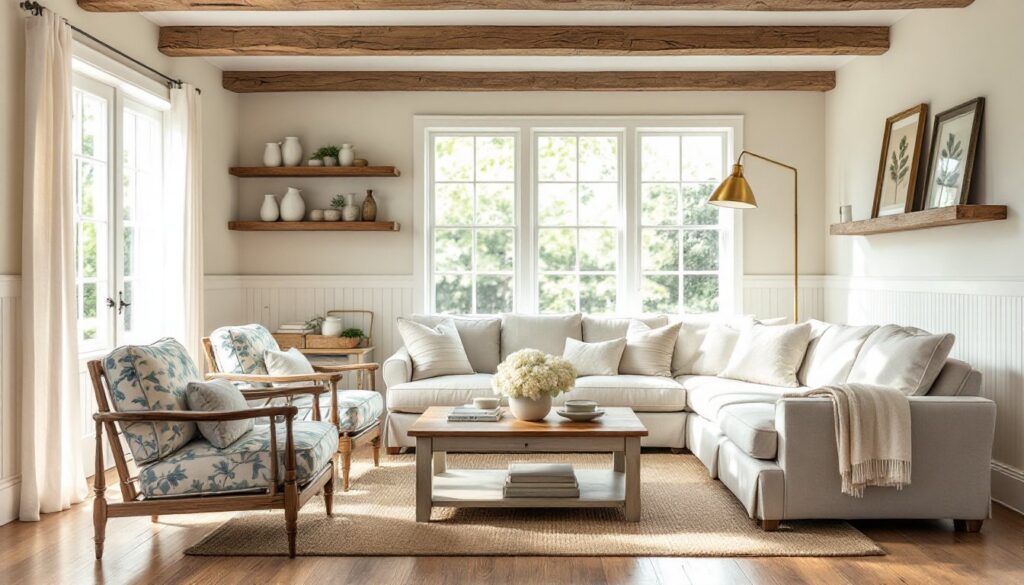
Analogous colors neighbor each other on the wheel, like blue, blue-green, and green. These schemes feel harmonious and easy on the eye, ideal for open-concept spaces where you want smooth transitions. A living room flowing into a kitchen might use warm analogous tones: cream walls, caramel trim, and terracotta accents.
Triadic color schemes use three colors equally spaced around the wheel. They’re trickier to balance in interiors but work well when one color dominates (60%), another supports (30%), and the third accents (10%). Understanding interior design color theory prevents the common mistake of treating all three equally, which tends toward chaotic rather than dynamic.
Warm colors (reds, oranges, yellows) advance visually, making walls feel closer. Cool colors (blues, greens, purples) recede, expanding perceived space. This isn’t just theory, painting a narrow hallway in cool tones versus warm tones can alter perceived width by 10-15% according to spatial perception studies.
Popular Color Schemes That Work
Monochromatic schemes use variations of a single hue, light blue walls, medium blue furniture, navy accents. They’re foolproof and sophisticated but require texture variety (linen, velvet, wood grain) to avoid flatness. Add metallic finishes or natural materials to break up same-color monotony.
The 60-30-10 rule provides foolproof proportion for balanced rooms. Dedicate 60% of the space to a dominant color (usually walls), 30% to a secondary color (upholstery, large furniture), and 10% to an accent color (pillows, artwork, accessories). This prevents any single color from overwhelming while maintaining visual interest. Designers consistently rely on this proportion strategy for cohesive results.
Neutral-plus-accent schemes pair greige, beige, or gray bases with one bold color. It’s the safe approach for homeowners nervous about commitment, change the accent color through pillows and art without repainting. Current popular accents include mustard yellow, forest green, and rust.
Earthy natural palettes draw from outdoor tones: terracotta, olive, clay, sand, charcoal. These schemes work across decorating styles from modern to rustic and pair naturally with wood, stone, and metal finishes common in home construction.
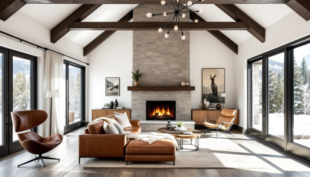
High-contrast schemes pair very light and very dark values, white walls with black trim, or pale gray with charcoal accents. They create drama and definition, particularly effective in modern classic approaches that blend traditional proportions with contemporary boldness.
How to Choose Colors for Different Rooms
Kitchens handle grease, moisture, and heavy traffic. Use semi-gloss or satin finish paint for easier cleaning, flat paint shows every splatter. Warm neutrals (creamy whites, soft grays with beige undertones) keep kitchens feeling fresh while hiding minor imperfections. Bold accent walls work behind open shelving but avoid them on cooking walls where grease buildup shows.
White upper cabinets with darker lower cabinets create visual balance and hide wear near the floor. If painting cabinets, use oil-based or hybrid alkyd paint formulated for durability, standard wall paint chips on cabinet doors within months.
Bedrooms benefit from cooler, muted tones that promote rest. Blues, soft greens, and lavenders test well for sleep quality, though personal preference matters more than color psychology studies suggest. South-facing bedrooms receive warm afternoon light that intensifies yellows and reds, compensate with cooler base tones. North-facing rooms get cooler light, so warm colors prevent them from feeling sterile.
Consider ceiling color in bedrooms where people spend time looking up. A ceiling one shade lighter than walls creates subtle definition without harsh contrast.
Bathrooms need moisture-resistant paint, look for mold and mildew-resistant formulas with satin or semi-gloss sheen. Light colors maximize the effect of typically small square footage and limited natural light. Powder rooms with no showers tolerate bolder choices: full baths see enough humidity that darker colors can show water spots.
Living rooms anchor a home’s color scheme. They connect to multiple spaces in open floor plans, so choose colors that complement adjacent areas. Test paint samples on multiple walls, color shifts dramatically based on natural light direction. Paint large poster boards instead of small patches: move them around the room throughout the day to see how morning, midday, and evening light affects the color.
Hallways connecting different rooms work best in neutral transition colors. Extending the living room color into the hallway creates flow: switching to white or cream provides a visual reset between distinct spaces.
The Psychology of Color in Home Design
Color psychology gets oversimplified in design advice, but directional trends hold up across cultures. Warm colors (reds, oranges, yellows) stimulate energy and conversation, they raise perceived room temperature by a few degrees and work well in social spaces like dining rooms and kitchens.
Cool colors (blues, greens, purples) lower physiological arousal and work in spaces meant for focus or rest. Home offices benefit from soft blues that improve concentration without the clinical feel of stark white. Avoid intense blues in dining areas, they suppress appetite, which matters if you’re trying to create welcoming meal spaces.
Red increases heart rate and energy but overwhelms in large doses. Use it as an accent or in spaces people pass through rather than linger. Orange shares red’s energizing properties but feels more playful and less aggressive. Yellow stimulates optimism but too much causes anxiety, kitchens and breakfast nooks handle it better than bedrooms.
Green balances warm and cool, making it versatile across room types. It tests well for stress reduction and works in any space. Forest greens trend strongly in 2026, replacing the mint and sage popular in previous years.
Gray dominated interiors for the past decade but suffers from color temperature sensitivity. Cool grays with blue undertones feel sterile in north-facing rooms. Warm grays (greige) with beige or taupe undertones avoid that problem. Test grays against both natural and artificial light, LEDs shift color temperature compared to incandescent bulbs.
Neutral doesn’t mean boring. Layering whites, creams, tans, and grays in different textures creates sophisticated spaces, particularly when combined with natural wood tones and textiles.
Practical Tips for Implementing Color in Your Home
Sample before committing. Paint stores sell sample sizes (usually 8 oz) for $3-5. Paint 2’×2′ sections on at least two walls, one receiving direct light, one in shadow. Live with samples for several days, checking appearance in morning, afternoon, and evening light. Colors shift dramatically: what looks perfect at noon might read completely different at 7 PM under lamps.
Prime before painting, especially over dark colors or fresh drywall. Primer coverage runs about 400 sq ft per gallon on smooth surfaces, less on textured walls. Skipping primer means uneven color and needing extra coats. Use tinted primer when covering dark colors with light ones, have the paint store tint it to 50% of your finish color.
Paint trim first, then walls, then touch up trim. Let trim paint dry fully (24-48 hours depending on humidity) before taping it off for wall paint. Use FrogTape or similar low-tack painter’s tape to avoid pulling off fresh paint.
One gallon of paint covers approximately 350-400 sq ft with one coat on smooth, primed walls. Textured walls or porous surfaces absorb more and reduce coverage. Calculate square footage (length × height for each wall, minus windows and doors) and divide by 350 to determine gallons needed. Buy extra, running out mid-wall creates lap marks, and getting an exact match later is nearly impossible even with the same formula.
Finish matters as much as color. Flat/matte hides wall imperfections but shows every scuff and doesn’t clean well, use it on low-traffic ceilings and adult bedrooms. Eggshell offers slight sheen and better cleanability for living rooms and dining rooms. Satin handles moisture and cleaning well for kitchens, bathrooms, hallways, and kids’ rooms. Semi-gloss and gloss work on trim, doors, and cabinets where durability matters most.
Test colors against fixed elements. Lay paint chips next to flooring, countertops, and large furniture pieces that aren’t changing. A beige that looks perfect in isolation might clash with honey oak floors or pull wrong against gray-veined quartz counters.
Building codes don’t regulate interior paint color, but lead-safe practices apply in homes built before 1978. If you’re sanding or scraping painted surfaces in a pre-1978 home, check local regulations about lead paint remediation, some jurisdictions require testing and certified contractors for projects that disturb more than certain square footage.
Consider rental-friendly options for commitment-phobic decorators. Peel-and-stick wallpaper, large-scale art, and colorful textiles allow experimenting with bold choices without permanent changes. Many budget makeover approaches focus on removable color additions that work in apartments or homes headed toward resale.
Conclusion
Color transforms spaces more powerfully than furniture arrangement or accessories, but it requires understanding basic relationships and practical application techniques. The color wheel provides the foundation: room-specific considerations and proper prep work ensure results match intentions. Whether embracing current trends or creating timeless neutrals, testing samples, using correct primers, and selecting appropriate paint finishes make the difference between professional results and costly do-overs. Start with one room, master the process, then confidently expand the palette throughout the home.